Using JIDE Charts it is easy to configure different presentation styles for the same data.
JIDE Charts also has the ability to fit a polynomial curve to the data using the method of least squares
Sometimes a scatter plot is a better representation of the data than a line plot.
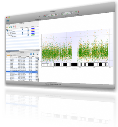
This is an application we developed to support genetics research.
A custom visualisation developed to help identify outliers in the data.
This application helps researchers to analyse time series data of heartbeat traces.
Add value by combining disparate information sources - here,
a weather web service is queried and the results used with a mapping component.
We can do custom layouts too.
This demonstration uses IBM's SWT technology and shows how object models can be developed at run-time.
We developed this application to help a client process DNA sequences.
A simple content management system used in-house.
An application for inspecting and editing ZIP archives.
We were asked to develop this specialized scientific application with a multi-lingual user-interface.
A demonstration of colour gradients, shadows and texture fills.


